Končar House Appliances
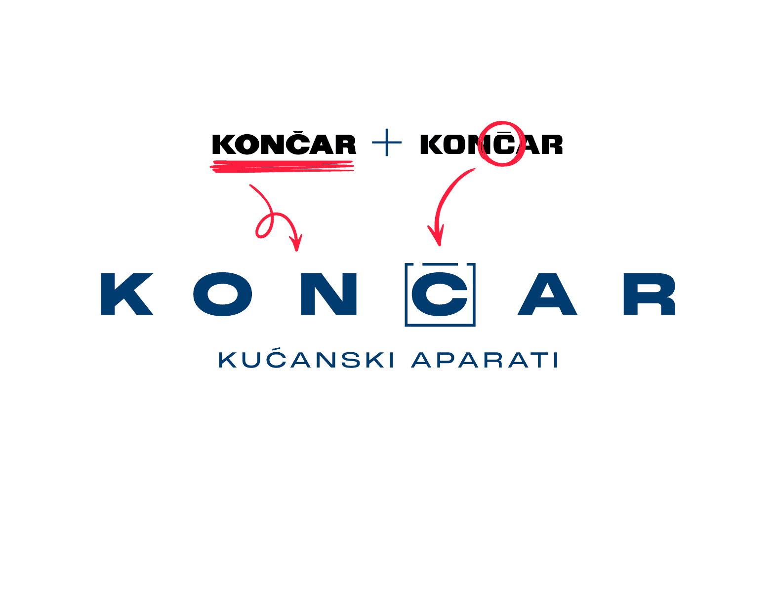
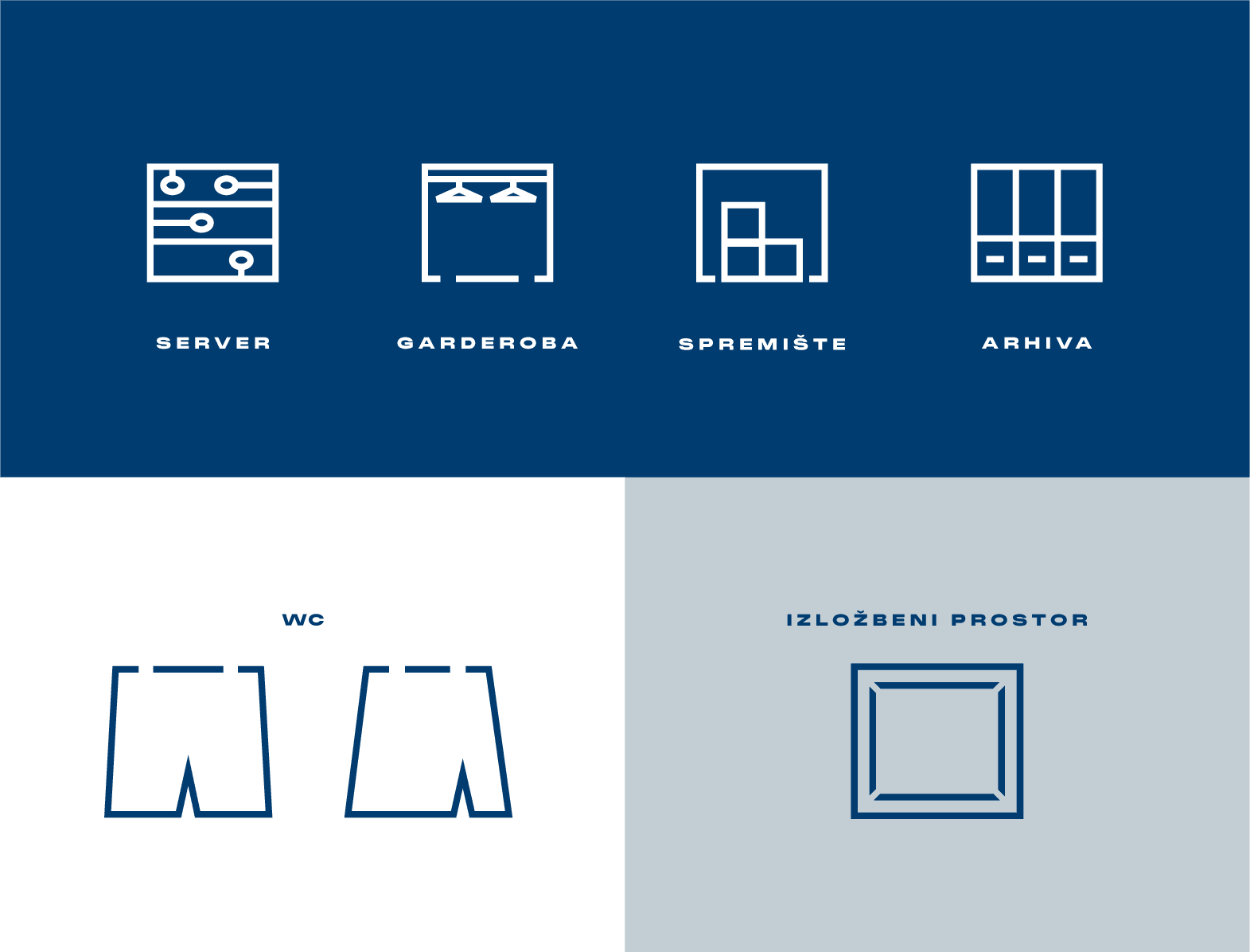
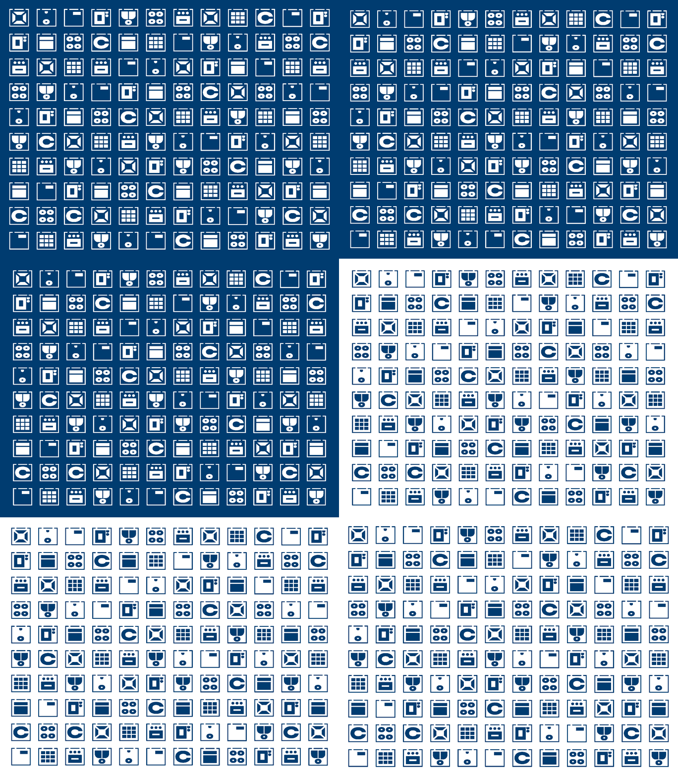
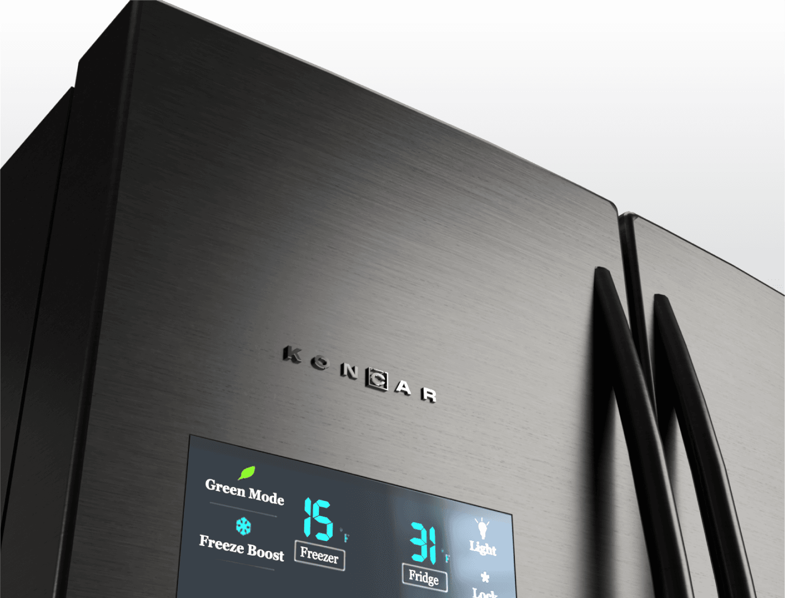
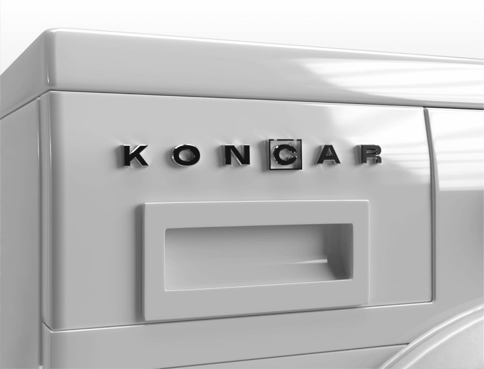
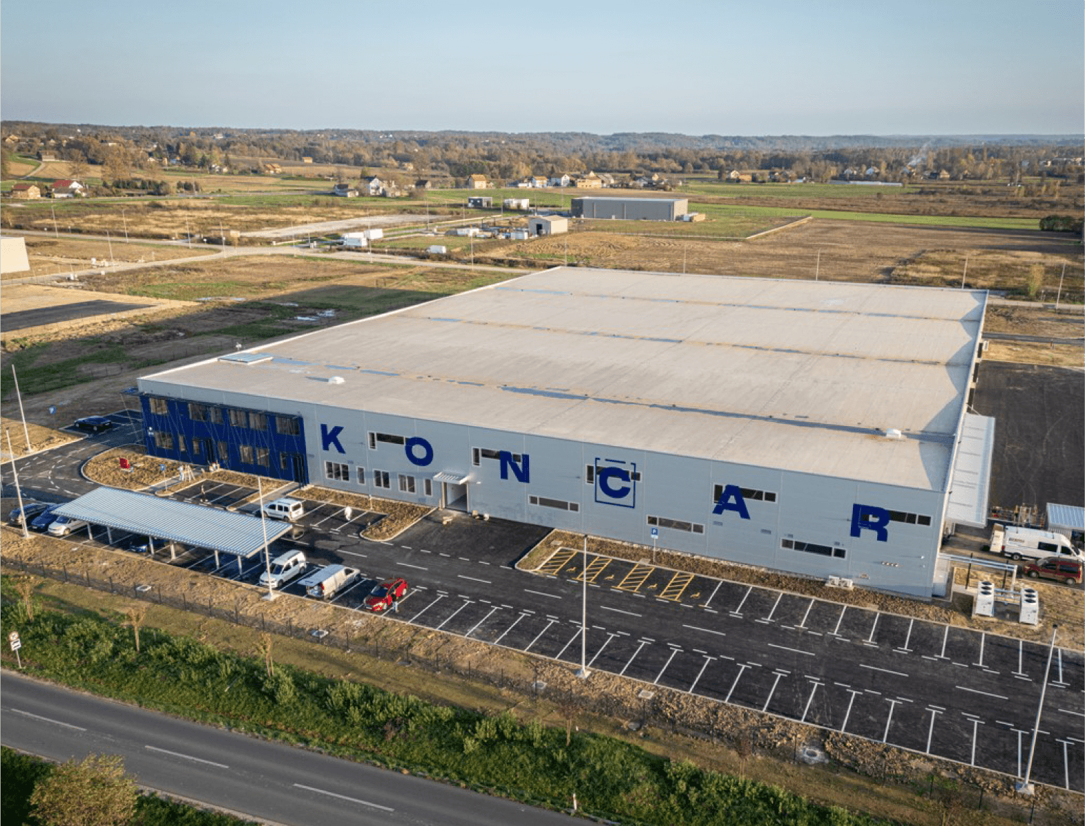
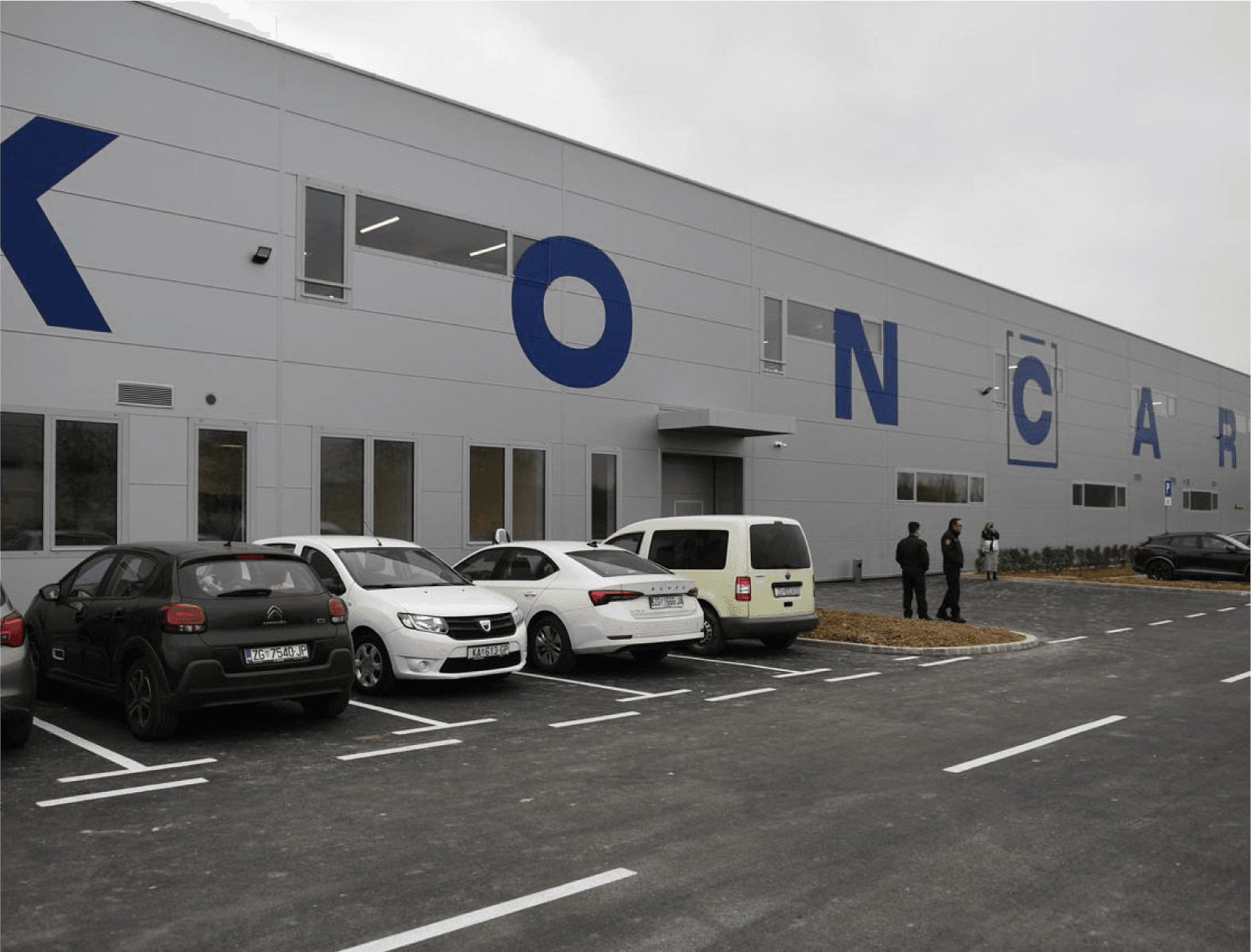
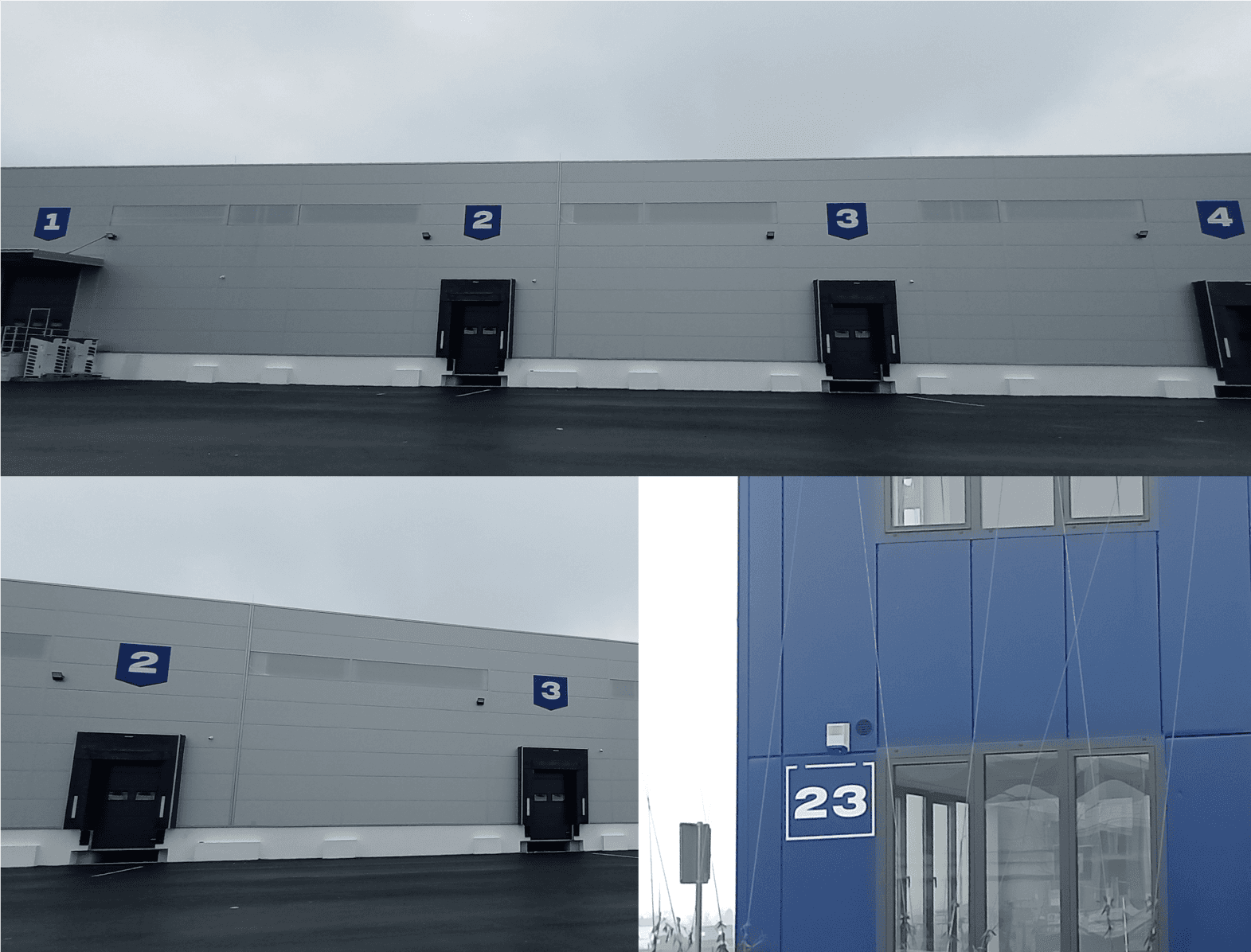
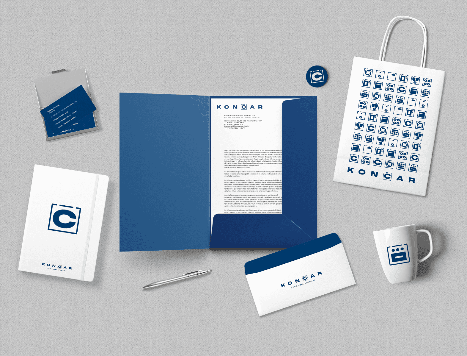
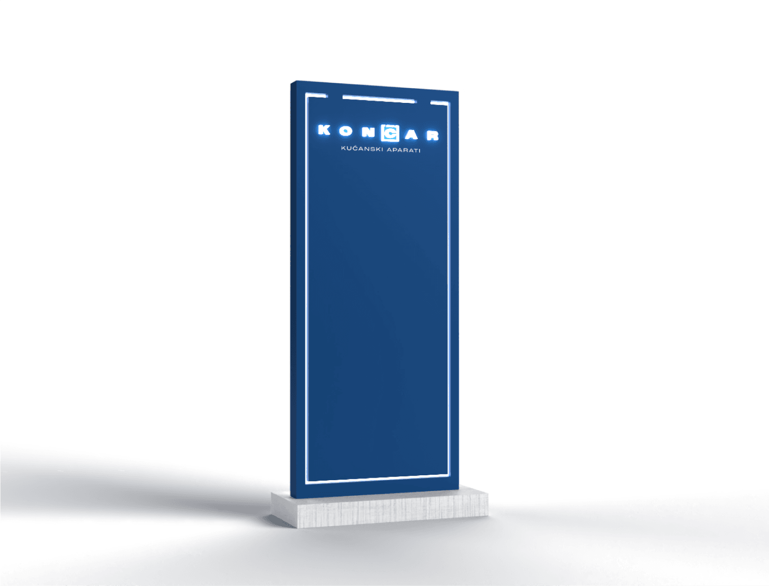
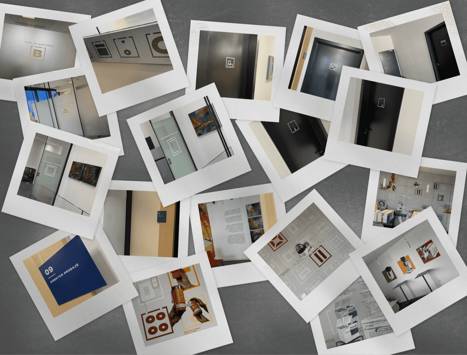
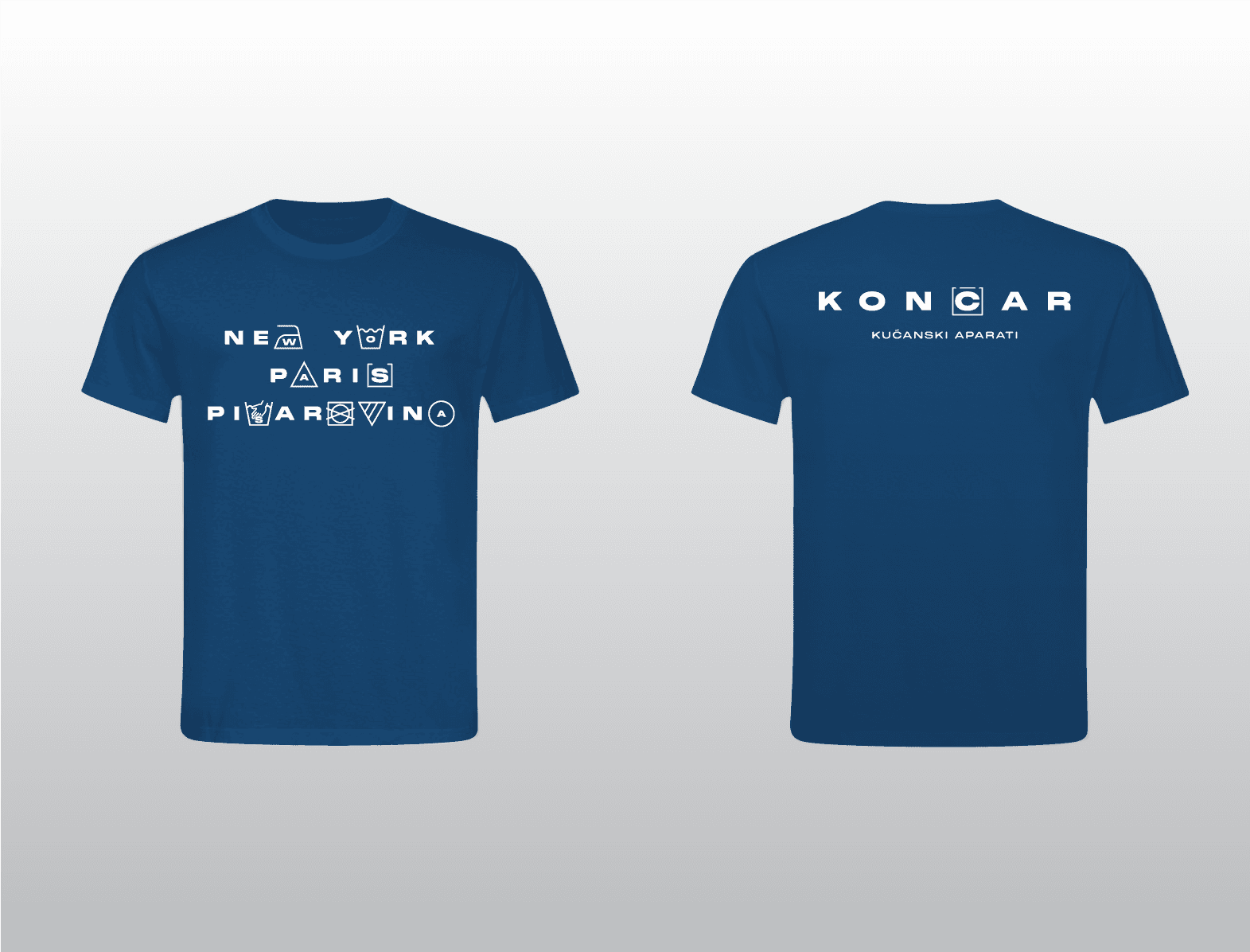
With Končar House Appliances becoming independent, we developed a new logotype that stays connected to the parent brand while establishing its own identity. The approach is purely typographic, with small interventions that allow the mark to also function as a standalone symbol. The key move builds on the diacritic above the letter “č,” turning it into a subtle reference to a washing machine. A small detail that connects the category, reinforces the company’s Croatian roots, and makes the mark more distinctive. Beyond the logotype, we designed a signage system for the new building, along with a custom icon set for both internal and external use. Additional graphics reference the company’s history while quietly shaping shared spaces.
CLIENT
Rajko Šenjug
SERVICE
Visual identity, Signage, Branding
YEAR
2024-2025